
I am reminded of the thought experiments I went through years ago when the sound cards went from 8 bit to 16bit to being able to reproduce CD quality sound and better. Now days no one thinks about a computer that can’t reproduce sound with sub-CD quality. I remember talking about how this would change games, music, and entertainment as we knew it. But there were things that were not brought up as I look back. I didn’t think about how sound quality of this nature would make just about every sound emitting platform into a software problem. Now granted not every problem in the sound arena has been solved. We still have not reproduced the human voice synthetically without using another human as the input. But this is about it. Our computers can speak to us, but in the end, they sound like computers. This isn’t necessarily a bad thing, and its only a matter of years until this synthetic distinction is a matter of choice.
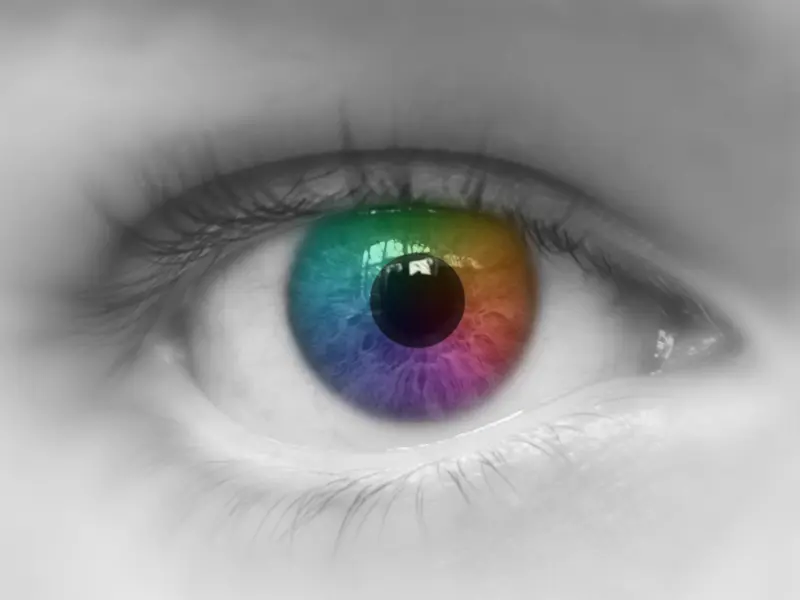
We already have monitors everywhere that can display a larger number of colors than the human eye can distinguish. Now granted these monitors do not fully replicate all the colors a human can see. But this problem was essentially solved most most colors when computers went to 24 bit color depths.
So what does it mean to me that I can no longer see the pixels that make up the interfaces that I work with? I think the first obvious answer is that my images and text look sharper and cleaner. But what does this mean. From a visual perspective, what’s the difference between looking at the Mona Lisa and looking at a reproduction of the Mona Lisa at a resolution above the what the human eye can distinguish. Granted if you had the real Mona Lisa you could move your head and see the 3D textures of the paint on the wood. But in the end, what would the difference be between of an image of the Mona Lisa scanned at 220 DPI and the real thing. Again, there are differences. But they are diminishing.
So what does this mean? I think that what this means is that I now have a choice when I put together a user interface. The question is. Do I want to display a symbol of something or do I want to display the actual thing. Let me put it another way. Years ago, in High School, I was taking a computer programming class. We had to put together a graphics introduction using Apple ][ graphics. The screen supported 40 pixels by 40 pixels with 4 lines of text. The number of colors available was 15/16 (with two being visually the same). My introduction started with a sword imbedded in the ground, catching fire and swinging around to write my name across the screen. It was rather cool for the day, but in the end, it was just a handful of red, yellow, orange, and grey pixels. It would be laughable today. But how would I do this today? I could do it on an Apple Mac Book Pro with such color correctness and pixel density that a person sitting 2 – 3 feet away from the monitor couldn’t tell it from a “real” sword catching fire and engraving my name into the screen. Well, except for the fact that swords don’t catch fire by themselves nor do they fly. More’s the pity.
So what does this mean? I think that the point I am making is that I believe that there are two approaches heading forward in User Interface design. If I can reproduce with accuracy the color and textures of physical objects and items, will I use those analogues for my interface? Why should I? If I can draw the symbol with such accuracy, why don’t I draw the real thing instead?
The problem is that as with most things a computer is not dealing with nouns such as person’s or places, or things. Its dealing with nouns that fall into the category of ideas. And even if you are dealing with persons or places, is that what you really want? Think about the address book of the future. It has your information in it. First name, Last name. Those are text fields. Phone number. Also a text field. Email address. Text Field. Home Address. . . Text Field? No that’s a symbol pointing to a place on a map. OK, so a map. Well, no the map is also a symbol. How about a satellite image of your house? That also isn’t your house. Now granted the home address is probably something you will always need to keep as its a good agreed upon symbol. However how do you represent it to your users. Lets move on and see what other problems we pull up. How about birthday? Do you represent it as a date? How about a birth certificate? How about representing the birthday as a daily counter to the next event? Again, just like the home address, you probably need the date in the computer as the input to give the user and to share with others, but how do you represent it on the screen. You now have the ability to reproduce something with almost 100% fidelity. This leads me to the final entry in the address book. What symbol do I use to point to myself. Some programs let you use an image, some include your name. On a 40 x 40 pixel screen, there is no option for a picture, but on a 220dpi monitor, you could get a really accurate picture of me.
Now lets say we decide on how we are going to do our address book. I really don’t care what you came up with as your decision points on the above discussion, its the next question that’s really important. You launch your computer 5 – 10 years from now. It boots up in almost nothing flat and you are going to go look for your new co-workers information in the address book. What does that application look like. Is that application a small leather bound black book whose pages wrinkle, age, and turn like the Moleskine notebook? Or is it a collection of pictures, maps, and text? Does your user interface at the top look like a symbolic representation of an item or does it look like the items it contains.
It is my opinion that the world is about to see which of these user interface directions is more successful. Apple is clearly going towards the Notebook, while Microsoft with their Metro interface is heading towards the collection of pictures, maps, and text.


Comments
With an account on the Fediverse or Mastodon, you can respond to this post. Since Mastodon is decentralized, you can use your existing account hosted by another Mastodon server or compatible platform if you don't have an account on this one. Known non-private replies are displayed below.